
Decide what each reference contributes
When choosing a reference, identify what you want to carry into the design. That might be the space around the subject, the color of the shadows, the type scale, or the placement of a bright detail. Describe those choices in the prompt so you can judge the result against them.
For this redesign, the references supplied an inky background, softly painted highlights, lavender color, grain, and small starbursts. The existing pink-brain robot supplied the identity. Its face, armor, and reaching gesture needed to remain recognizable while the treatment changed.
Image Gen Soul separates the role of each reference. For this site, the posters informed the color and illustration treatment, while the existing robot defined the character. The page content came from the services and products the site needed to explain.
Compose the identity first
Before generating page layouts, assemble the mascot and wordmark alongside the fonts, interface colors, and a sample of the copy. That lets you check whether the pieces work together at the sizes you expect to use.
This site pairs Manrope for readable interface text with Instrument Serif for expressive display lines. Midnight is the main canvas; paper gives longer content a quieter surface. Lavender carries primary actions, while coral and pale gold appear sparingly in the star details.
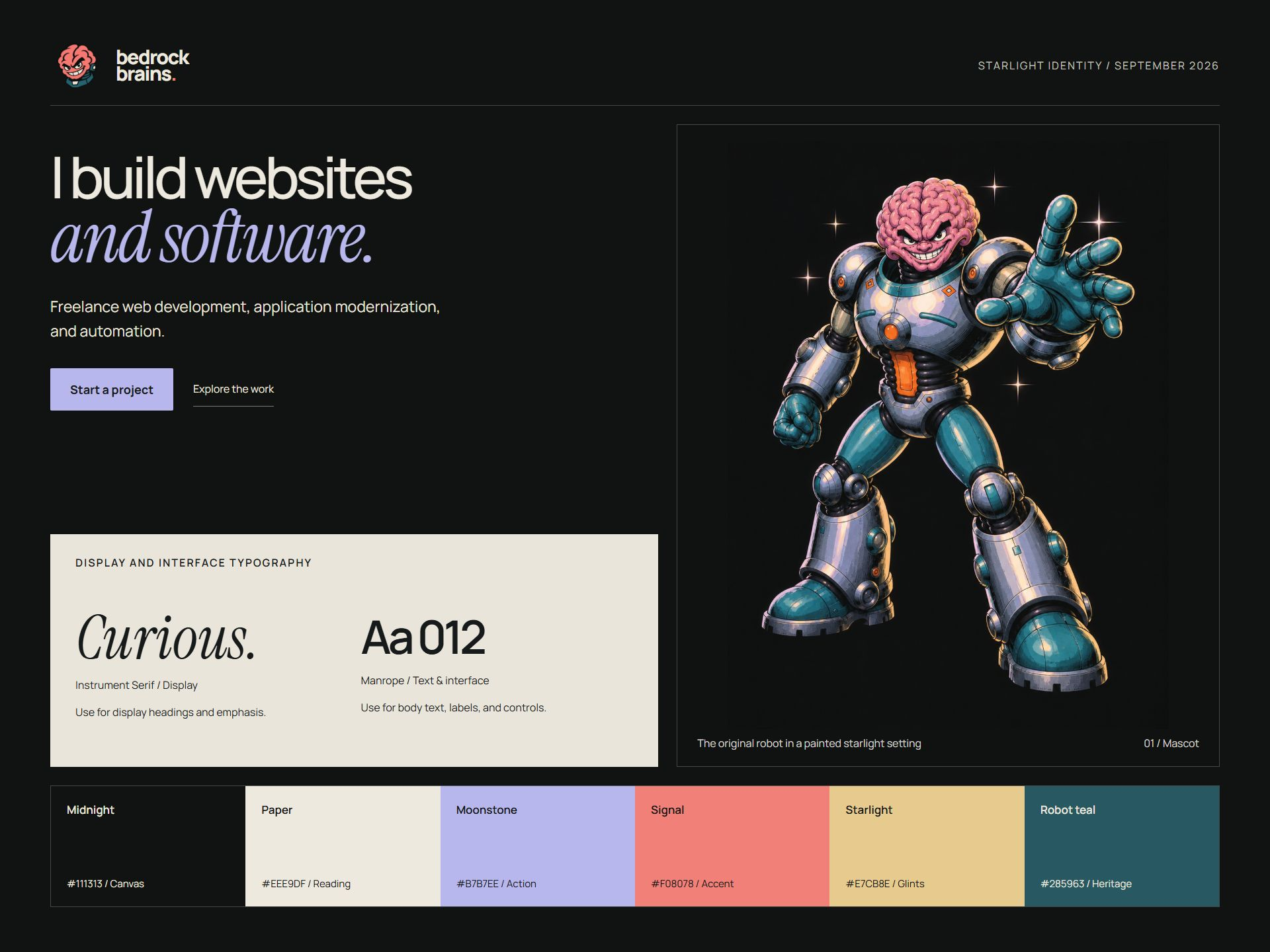
Use the actual font files in the board and place the artwork at its intended scale. Generated lettering may suggest a type treatment, but it cannot confirm how the chosen font will wrap or read in the browser.
Plan the pages and shared templates
Each page needs its own content and interactions. The work index lets visitors compare projects, while the journal needs search and a reading layout. The contact page explains that its brief builder prepares text locally and does not send a message.
The page inventory for this site included the homepage, work index, about, services, journal index, and contact page, plus shared case-study and article templates. Each received a layout concept before implementation. The downloadable 1920 × 5000 mockups now show the implemented pages.
Keep the original generation outputs and record later changes honestly. A concept may include mistaken text or an invented product image. The working page should use verified product descriptions and actual screenshots, with that adjustment recorded alongside the reference.
Build and test the controls
Generate the artwork separately, then build the text and controls in HTML. Visitors need to be able to select article text, zoom the page, follow links, and use forms with a keyboard.
This site uses CSS for the starbursts and a canvas for the moving particles. A pause control and the visitor’s reduced-motion preference stop the animation while leaving the content visible.
Check the complete paths in the browser. Search for an existing article, try a term with no results, clear the search, and open an article. Repeat the navigation on a narrow screen, then prepare and copy a project brief to check the contact page’s behavior.
A practical handoff checklist
- Record the reference roles and preserve the recognizable brand elements.
- Compose and inspect the brandkit using the fonts and assets you will ship.
- Make a concept for every distinct page and useful shared template.
- Build with live content, then check the complete journey in a browser.
Explore Image Gen Soul or read the source workflow. The skill provides the process; image generation and implementation still depend on the tools available in your environment.