
A request for a "clean, modern page" leaves most design decisions open. A visual reference gives the coding agent something specific to match, including type scale, spacing, and the balance between artwork and text.
In this workflow, we generate layout concepts before writing the interface. That gives us a chance to choose the composition and prepare the artwork before asking a coding agent to implement it.
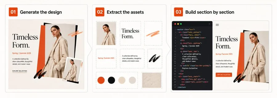
Generate section views when you need more detail
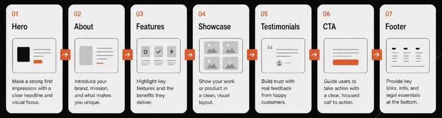
When a full-page concept makes the details too small to judge, generate separate views of the hero, about section, showcase, and footer. Keep the palette and typography consistent across those views.
For example, prompt: "Generate a detailed Hero section for a flower shop. Style: editorial, minimal, warm."
"Generate a website section concept for a premium local flower business called Seven Flowers. Create a separate, highly detailed layout comp for the Hero section. Style direction: minimal, editorial, calm, warm, and natural. Avoid generic SaaS elements, card lists, and gradient blobs."
Describe visible choices in the prompt
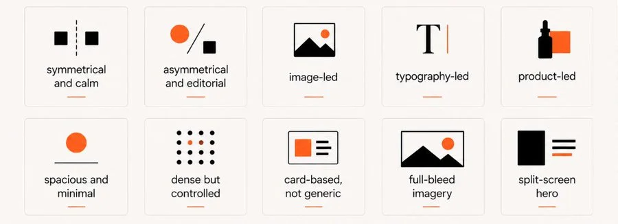
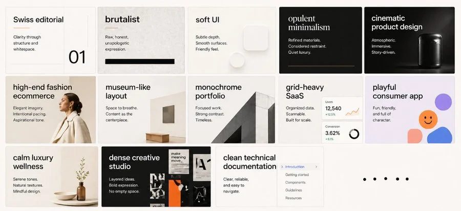
Style names can help narrow a prompt, but pair them with visible constraints. Specify the grid, type contrast, colors, and image treatment you expect instead of relying on a word such as "modern."
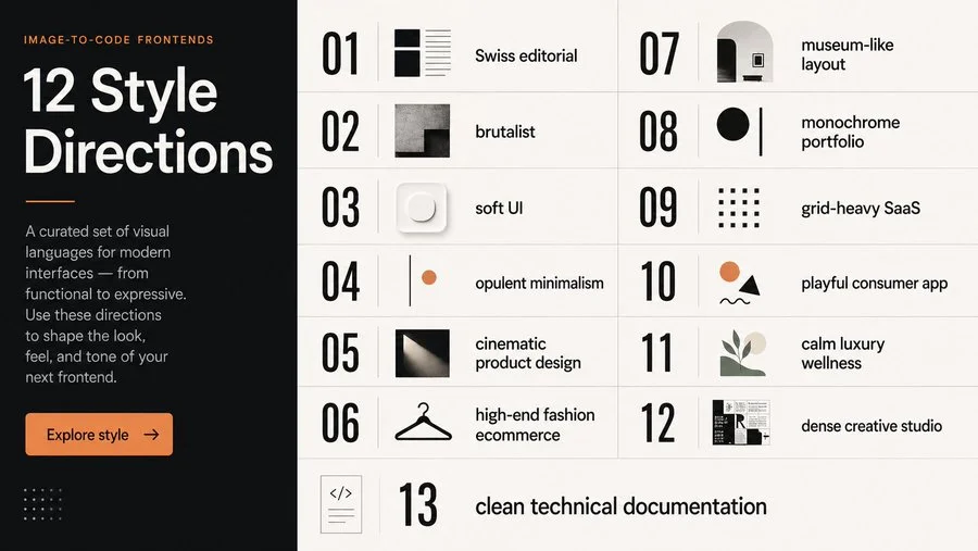
- Swiss editorial: specify contrasting type sizes and a consistent grid.
- Opulent minimalism: describe the dark palette, thin borders, and product photography you want.
- Brutalist terminal: specify monospace type, thick borders, and dense data grids.
Compare the layout options
Compare several generations and select the parts that fit the project. A hero from one concept and a footer from another may work together, provided their type, spacing, and colors are reconciled before implementation.
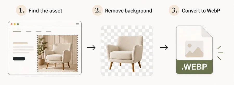
Prepare the artwork for the page
Generate custom mascots or illustrated objects separately so they can be placed in the layout. Remove unwanted backgrounds, check the edges, and compare file formats at the intended display size.
Give the coding agent a complete reference
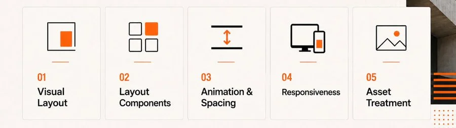
Start with the hero and give the coding agent its reference image, prepared artwork, and stack details, such as Next.js and Tailwind. Include the text and destinations for the controls it needs to build.
- The reference image for the Hero section.
- The isolated, optimized asset files.
- A clear tech stack context.
- A directive to reproduce the layout and typography as closely as possible.
Compare screenshots at the same viewport size
Take a screenshot of the running page and compare it with the concept. Give specific corrections, such as "Move this image 20px up and increase paragraph line-height." Recheck the result at the same viewport size.
Check the layout and the interactions
Check more than visual similarity. Text needs to remain readable when the viewport narrows or the visitor zooms in, and links and controls need to work with a keyboard.
- Alignment: Keep all text blocks and elements on a consistent alignment system.
- Spacing: compare margins and line height at desktop and mobile widths.
- Responsiveness: test narrow screens and text zoom before finalizing the layout.
- Brand consistency: check that sections use the same color roles and font families.
- Interaction: test keyboard navigation and reduced-motion behavior.
Source attribution: this archived article draws on Leon Lin’s image-to-code workflow. Original diagrams and referenced work remain attributed to their creators.